Preview .ExternalClass { width: 100%; background: inherit; background-color: inherit; } .ExternalClass p, .ExternalClass ul, .ExternalClass ol { Margin: 0; } .undoreset div p, .undoreset p { margin-bottom: 20px; } div[class^="aolmail_divbody"] { overflow: auto; } [owa] #ac-footer { padding: 20px 0px !important; background: inherit; background-color: inherit; }
@media only screen and (max-width: 600px) { /*-------------------------------------------------------------------------*\ Abandoned Cart widget \*------------------------------------------------------------------------*/ .td_abandoned-cart img {display: block;padding-right: 0 !important;padding-bottom: 0 !important;width: 100% !important;max-width: 100% !important;height: auto !important;} body { padding: 0!important; font-size:1em!important; } * { -webkit-box-sizing: border-box; -moz-box-sizing: border-box; box-sizing: border-box; } *[class].divbody {-webkit-text-size-adjust:none !important; width:auto !important;} *[class].td_picture img {width:auto !important;} *[class].td_text { line-height: 110%; } *[class].td_button { width: auto; } /* Collapse all block elements */ :not(.body) table { display: block!important; float:none!important; border-collapse:collapse !important; width:100% !important; min-width:100% !important; clear:both!important; } :not(.body) thead,
:not(.body) tbody, :not(.body) tr { display:block!important; float:none!important; width:100% !important; } :not(.body) th, :not(.body) td, :not(.body) p { display:block!important; float:none!important; width:100% !important; clear:both!important; } /* Remove browser default styling for elements */ ul, ol { margin-left: 20px; margin-bottom: 10px; margin-top: 10px; -webkit-margin-before: 0; -webkit-margin-after: 0; -webkit-padding-start: 0; } /* Set default height for spacer once collapse */ *[class].spacer { height: auto!important; } a[href^=date]{ color:inherit !important; text-decoration:none !important;} a[href^=telephone]{ color:inherit !important; text-decoration:none !important;} a[href^=address]{ color:inherit !important; text-decoration:none !important;} a[href^=email]{ color:inherit !important; text-decoration:none !important;} /* Default table cell height */ td[height="12"]{height:12px!important;font-size:12px!important;line-height:12px!important;}
td[height="0"]{height:0px!important;font-size:0px!important;line-height:0px!important;}
td[height="14"]{height:14px!important;font-size:14px!important;line-height:14px!important;} /*-------------------------------------------------------------------------*\ Product Widget \*-------------------------------------------------------------------------*/ .td_product > div { float: none !important; width: 100% !important; margin-bottom: 20px !important; } .td_product > div img { width: 75% !important; } /* Default social icons */ *[class].ac-social-icon-16 {width:16px !important; height:16px !important;} *[class].ac-social-icon-24 {width:24px !important; height:24px !important;} *[class].ac-social-icon-28 {width:28px !important; height:28px !important;} *[class].__ac_social_icons { margin-right: 0px !important; } }
@media only screen and (max-width: 320px) { #layout-row31230 { max-height: 0px!important; font-size: 0px!important; display: none!important; visibility: hidden!important; } #layout-row31231 .break-line { width: 100% !important; margin: auto !important; } #layout-row31238 img { width: 100% !important; height: auto !important; max-width: 320px !important; } #layout-row31241 img { width: 100% !important; height: auto !important; max-width: 320px !important; } #layout-row31244 img { width: 100% !important; height: auto !important; max-width: 320px !important; } #layout-row31247 img { width: 100% !important; height: auto !important; max-width: 320px !important; } #layout-row31250 img { width: 100% !important; height: auto !important; max-width: 320px !important; } #layout-row31251 .break-line { width: 100% !important; margin: auto !important; } #layout-row31259 .break-line { width: 100% !important; margin: auto !important; }
div.divbody { padding: 20px !important; } .td_rss .rss-item img.iphone_large_image { width: auto !important; } u + .body { display: table !important; width: 100vw !important; min-width: 100vw !important; } u + .body table { display: table !important; width: 100% !important; min-width: 100% !important; } u + .body td { display: block !important; width: 100% !important; min-width: 100% !important; } u + .body img { display: inline-block !important; margin: auto !important; width: auto !important; vertical-align: bottom !important; } u + .body center { display: block !important; margin: auto !important; width: 100% !important; min-width: 100% !important; text-align: center !important; } u + .body table._ac_social_table, u + .body table._ac_social_table td, u + .body table._ac_social_table div, u + .body table._ac_social_table a { display: inline-block !important; margin: auto !important; width: auto !important; min-width: auto !important; text-align: center !important;
} u + .body table._ac_social_table img { display: inline-block !important; margin: auto !important; width: 32px !important; min-width: 32px !important; max-width: 32px !important; }
}
@media only screen and (max-width: 375px) { #layout-row31230 { max-height: 0px!important; font-size: 0px!important; display: none!important; visibility: hidden!important; } #layout-row31231 .break-line { width: 100% !important; margin: auto !important; } #layout-row31238 img { width: 100% !important; height: auto !important; max-width: 375px !important; } #layout-row31241 img { width: 100% !important; height: auto !important; max-width: 375px !important; } #layout-row31244 img { width: 100% !important; height: auto !important; max-width: 375px !important; } #layout-row31247 img { width: 100% !important; height: auto !important; max-width: 375px !important; } #layout-row31250 img { width: 100% !important; height: auto !important; max-width: 375px !important; } #layout-row31251 .break-line { width: 100% !important; margin: auto !important; } #layout-row31259 .break-line { width: 100% !important; margin: auto !important; } div.divbody { padding: 20px !important; }
.td_rss .rss-item img.iphone_large_image { width: auto !important; } u + .body { display: table !important; width: 100vw !important; min-width: 100vw !important; } u + .body table { display: table !important; width: 100% !important; min-width: 100% !important; } u + .body td { display: block !important; width: 100% !important; min-width: 100% !important; } u + .body img { display: inline-block !important; margin: auto !important; width: auto !important; vertical-align: bottom !important; } u + .body center { display: block !important; margin: auto !important; width: 100% !important; min-width: 100% !important; text-align: center !important; } u + .body table._ac_social_table, u + .body table._ac_social_table td, u + .body table._ac_social_table div, u + .body table._ac_social_table a { display: inline-block !important; margin: auto !important; width: auto !important; min-width: auto !important; text-align: center !important; } u + .body table._ac_social_table img {
display: inline-block !important; margin: auto !important; width: 32px !important; min-width: 32px !important; max-width: 32px !important; }
}
@media only screen and (max-width: 414px) { #layout-row31230 { max-height: 0px!important; font-size: 0px!important; display: none!important; visibility: hidden!important; } #layout-row31231 .break-line { width: 100% !important; margin: auto !important; } #layout-row31238 img { width: 100% !important; height: auto !important; max-width: 414px !important; } #layout-row31241 img { width: 100% !important; height: auto !important; max-width: 414px !important; } #layout-row31244 img { width: 100% !important; height: auto !important; max-width: 414px !important; } #layout-row31247 img { width: 100% !important; height: auto !important; max-width: 414px !important; } #layout-row31250 img { width: 100% !important; height: auto !important; max-width: 414px !important; } #layout-row31251 .break-line { width: 100% !important; margin: auto !important; } #layout-row31259 .break-line { width: 100% !important; margin: auto !important; } div.divbody { padding: 20px !important; }
.td_rss .rss-item img.iphone_large_image { width: auto !important; } u + .body { display: table !important; width: 100vw !important; min-width: 100vw !important; } u + .body table { display: table !important; width: 100% !important; min-width: 100% !important; } u + .body td { display: block !important; width: 100% !important; min-width: 100% !important; } u + .body img { display: inline-block !important; margin: auto !important; width: auto !important; vertical-align: bottom !important; } u + .body center { display: block !important; margin: auto !important; width: 100% !important; min-width: 100% !important; text-align: center !important; } u + .body table._ac_social_table, u + .body table._ac_social_table td, u + .body table._ac_social_table div, u + .body table._ac_social_table a { display: inline-block !important; margin: auto !important; width: auto !important; min-width: auto !important; text-align: center !important; } u + .body table._ac_social_table img {
display: inline-block !important; margin: auto !important; width: 32px !important; min-width: 32px !important; max-width: 32px !important; }
}
@media only screen and (max-width: 667px) { #layout-row31230 { max-height: 0px!important; font-size: 0px!important; display: none!important; visibility: hidden!important; } #layout-row31231 .break-line { width: 100% !important; margin: auto !important; } #layout-row31238 img { width: 100% !important; height: auto !important; max-width: 667px !important; } #layout-row31241 img { width: 100% !important; height: auto !important; max-width: 667px !important; } #layout-row31244 img { width: 100% !important; height: auto !important; max-width: 667px !important; } #layout-row31247 img { width: 100% !important; height: auto !important; max-width: 667px !important; } #layout-row31250 img { width: 100% !important; height: auto !important; max-width: 650px !important; } #layout-row31251 .break-line { width: 100% !important; margin: auto !important; } #layout-row31259 .break-line { width: 100% !important; margin: auto !important; } div.divbody { padding: 20px !important; }
.td_rss .rss-item img.iphone_large_image { width: auto !important; } u + .body { display: table !important; width: 100vw !important; min-width: 100vw !important; } u + .body table { display: table !important; width: 100% !important; min-width: 100% !important; } u + .body td { display: block !important; width: 100% !important; min-width: 100% !important; } u + .body img { display: inline-block !important; margin: auto !important; width: auto !important; vertical-align: bottom !important; } u + .body center { display: block !important; margin: auto !important; width: 100% !important; min-width: 100% !important; text-align: center !important; } u + .body table._ac_social_table, u + .body table._ac_social_table td, u + .body table._ac_social_table div, u + .body table._ac_social_table a { display: inline-block !important; margin: auto !important; width: auto !important; min-width: auto !important; text-align: center !important; } u + .body table._ac_social_table img {
display: inline-block !important; margin: auto !important; width: 32px !important; min-width: 32px !important; max-width: 32px !important; }
} <!--

|
|
|
|
|
|
|
|
|
|
|
|
|
|
Why Remote Work Today is a Chance to Change Your Culture
_____________________
What should we keep doing? What do we need to change?
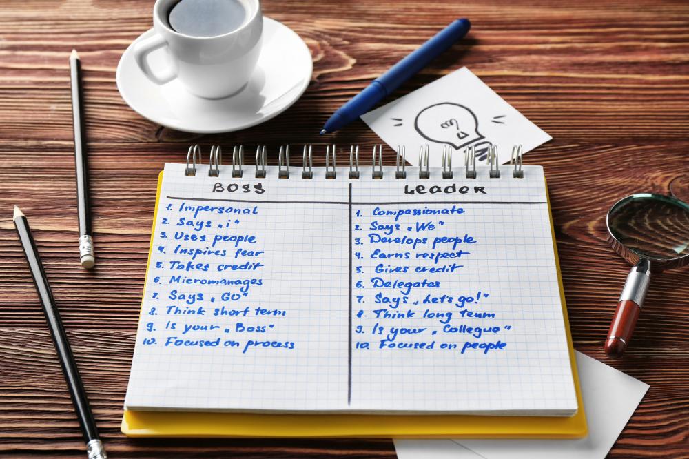
You are living a long-proven principle: you learn much about your team or organizational culture in times of crisis. The move to remote work may have exposed some cracks in your culture and may have highlighted some strengths, too. This new time of crisis and the remote work that goes with it is a tremendous opportunity to do more than learn about our culture, but to change it. Let’s talk about how you can create culture change during remote work.
#text_div26520, #text_div26520 div { line-height: 120% !important; };
|
|
|
|
|
|
|
|
|
|
|
|
|
|
