Preview .ExternalClass { width: 100%; background: inherit; background-color: inherit; } .ExternalClass p, .ExternalClass ul, .ExternalClass ol { Margin: 0; } .undoreset div p, .undoreset p { margin-bottom: 20px; } div[class^="aolmail_divbody"] { overflow: auto; } [owa] #ac-footer { padding: 20px 0px !important; background: inherit; background-color: inherit; }
@media only screen and (max-width: 600px) { /*-------------------------------------------------------------------------*\ Abandoned Cart widget \*------------------------------------------------------------------------*/ .td_abandoned-cart img {display: block;padding-right: 0 !important;padding-bottom: 0 !important;width: 100% !important;max-width: 100% !important;height: auto !important;} body { padding: 0!important; font-size:1em!important; } * { -webkit-box-sizing: border-box; -moz-box-sizing: border-box; box-sizing: border-box; } *[class].divbody {-webkit-text-size-adjust:none !important; width:auto !important;} *[class].td_picture img {width:auto !important;} *[class].td_text { line-height: 110%; } *[class].td_button { width: auto; } /* Collapse all block elements */ :not(.body) table { display: block!important; float:none!important; border-collapse:collapse !important; width:100% !important; min-width:100% !important; clear:both!important; } :not(.body) thead,
:not(.body) tbody, :not(.body) tr { display:block!important; float:none!important; width:100% !important; } :not(.body) th, :not(.body) td, :not(.body) p { display:block!important; float:none!important; width:100% !important; clear:both!important; } /* Remove browser default styling for elements */ ul, ol { margin-left: 20px; margin-bottom: 10px; margin-top: 10px; -webkit-margin-before: 0; -webkit-margin-after: 0; -webkit-padding-start: 0; } /* Set default height for spacer once collapse */ *[class].spacer { height: auto!important; } a[href^=date]{ color:inherit !important; text-decoration:none !important;} a[href^=telephone]{ color:inherit !important; text-decoration:none !important;} a[href^=address]{ color:inherit !important; text-decoration:none !important;} a[href^=email]{ color:inherit !important; text-decoration:none !important;} /* Default table cell height */ td[height="0"]{height:0px!important;font-size:0px!important;line-height:0px!important;}
td[height="14"]{height:14px!important;font-size:14px!important;line-height:14px!important;} /*-------------------------------------------------------------------------*\ Product Widget \*-------------------------------------------------------------------------*/ .td_product > div { float: none !important; width: 100% !important; margin-bottom: 20px !important; } .td_product > div img { width: 75% !important; } /* Default social icons */ *[class].ac-social-icon-16 {width:16px !important; height:16px !important;} *[class].ac-social-icon-24 {width:24px !important; height:24px !important;} *[class].ac-social-icon-28 {width:28px !important; height:28px !important;} *[class].__ac_social_icons { margin-right: 0px !important; } }
@media only screen and (max-width: 320px) { #layout-row28459 { max-height: 0px!important; font-size: 0px!important; display: none!important; visibility: hidden!important; } #layout-row28460 .break-line { width: 100% !important; margin: auto !important; } #layout-row28467 img { width: 100% !important; height: auto !important; max-width: 320px !important; } #layout-row28470 img { width: 100% !important; height: auto !important; max-width: 320px !important; } #layout-row28473 img { width: 100% !important; height: auto !important; max-width: 320px !important; } #layout-row28476 img { width: 100% !important; height: auto !important; max-width: 320px !important; } #layout-row28479 img { width: 100% !important; height: auto !important; max-width: 320px !important; } #layout-row28480 .break-line { width: 100% !important; margin: auto !important; } div.divbody { padding: 20px !important; } .td_rss .rss-item img.iphone_large_image { width:
auto !important; } u + .body { display: table !important; width: 100vw !important; min-width: 100vw !important; } u + .body table { display: table !important; width: 100% !important; min-width: 100% !important; } u + .body td { display: block !important; width: 100% !important; min-width: 100% !important; } u + .body img { display: inline-block !important; margin: auto !important; width: auto !important; vertical-align: bottom !important; } u + .body center { display: block !important; margin: auto !important; width: 100% !important; min-width: 100% !important; text-align: center !important; } u + .body table._ac_social_table, u + .body table._ac_social_table td, u + .body table._ac_social_table div, u + .body table._ac_social_table a { display: inline-block !important; margin: auto !important; width: auto !important; min-width: auto !important; text-align: center !important; } u + .body table._ac_social_table img { display: inline-block !important; margin: auto
!important; width: 32px !important; min-width: 32px !important; max-width: 32px !important; }
}
@media only screen and (max-width: 375px) { #layout-row28459 { max-height: 0px!important; font-size: 0px!important; display: none!important; visibility: hidden!important; } #layout-row28460 .break-line { width: 100% !important; margin: auto !important; } #layout-row28467 img { width: 100% !important; height: auto !important; max-width: 375px !important; } #layout-row28470 img { width: 100% !important; height: auto !important; max-width: 375px !important; } #layout-row28473 img { width: 100% !important; height: auto !important; max-width: 375px !important; } #layout-row28476 img { width: 100% !important; height: auto !important; max-width: 375px !important; } #layout-row28479 img { width: 100% !important; height: auto !important; max-width: 375px !important; } #layout-row28480 .break-line { width: 100% !important; margin: auto !important; } div.divbody { padding: 20px !important; } .td_rss .rss-item img.iphone_large_image { width: auto !important; } u + .body {
display: table !important; width: 100vw !important; min-width: 100vw !important; } u + .body table { display: table !important; width: 100% !important; min-width: 100% !important; } u + .body td { display: block !important; width: 100% !important; min-width: 100% !important; } u + .body img { display: inline-block !important; margin: auto !important; width: auto !important; vertical-align: bottom !important; } u + .body center { display: block !important; margin: auto !important; width: 100% !important; min-width: 100% !important; text-align: center !important; } u + .body table._ac_social_table, u + .body table._ac_social_table td, u + .body table._ac_social_table div, u + .body table._ac_social_table a { display: inline-block !important; margin: auto !important; width: auto !important; min-width: auto !important; text-align: center !important; } u + .body table._ac_social_table img { display: inline-block !important; margin: auto !important; width: 32px
!important; min-width: 32px !important; max-width: 32px !important; }
}
@media only screen and (max-width: 414px) { #layout-row28459 { max-height: 0px!important; font-size: 0px!important; display: none!important; visibility: hidden!important; } #layout-row28460 .break-line { width: 100% !important; margin: auto !important; } #layout-row28467 img { width: 100% !important; height: auto !important; max-width: 414px !important; } #layout-row28470 img { width: 100% !important; height: auto !important; max-width: 414px !important; } #layout-row28473 img { width: 100% !important; height: auto !important; max-width: 414px !important; } #layout-row28476 img { width: 100% !important; height: auto !important; max-width: 414px !important; } #layout-row28479 img { width: 100% !important; height: auto !important; max-width: 414px !important; } #layout-row28480 .break-line { width: 100% !important; margin: auto !important; } div.divbody { padding: 20px !important; } .td_rss .rss-item img.iphone_large_image { width: auto !important; } u + .body {
display: table !important; width: 100vw !important; min-width: 100vw !important; } u + .body table { display: table !important; width: 100% !important; min-width: 100% !important; } u + .body td { display: block !important; width: 100% !important; min-width: 100% !important; } u + .body img { display: inline-block !important; margin: auto !important; width: auto !important; vertical-align: bottom !important; } u + .body center { display: block !important; margin: auto !important; width: 100% !important; min-width: 100% !important; text-align: center !important; } u + .body table._ac_social_table, u + .body table._ac_social_table td, u + .body table._ac_social_table div, u + .body table._ac_social_table a { display: inline-block !important; margin: auto !important; width: auto !important; min-width: auto !important; text-align: center !important; } u + .body table._ac_social_table img { display: inline-block !important; margin: auto !important; width: 32px
!important; min-width: 32px !important; max-width: 32px !important; }
}
@media only screen and (max-width: 667px) { #layout-row28459 { max-height: 0px!important; font-size: 0px!important; display: none!important; visibility: hidden!important; } #layout-row28460 .break-line { width: 100% !important; margin: auto !important; } #layout-row28467 img { width: 100% !important; height: auto !important; max-width: 667px !important; } #layout-row28470 img { width: 100% !important; height: auto !important; max-width: 667px !important; } #layout-row28473 img { width: 100% !important; height: auto !important; max-width: 667px !important; } #layout-row28476 img { width: 100% !important; height: auto !important; max-width: 667px !important; } #layout-row28479 img { width: 100% !important; height: auto !important; max-width: 650px !important; } #layout-row28480 .break-line { width: 100% !important; margin: auto !important; } div.divbody { padding: 20px !important; } .td_rss .rss-item img.iphone_large_image { width: auto !important; } u + .body {
display: table !important; width: 100vw !important; min-width: 100vw !important; } u + .body table { display: table !important; width: 100% !important; min-width: 100% !important; } u + .body td { display: block !important; width: 100% !important; min-width: 100% !important; } u + .body img { display: inline-block !important; margin: auto !important; width: auto !important; vertical-align: bottom !important; } u + .body center { display: block !important; margin: auto !important; width: 100% !important; min-width: 100% !important; text-align: center !important; } u + .body table._ac_social_table, u + .body table._ac_social_table td, u + .body table._ac_social_table div, u + .body table._ac_social_table a { display: inline-block !important; margin: auto !important; width: auto !important; min-width: auto !important; text-align: center !important; } u + .body table._ac_social_table img { display: inline-block !important; margin: auto !important; width: 32px
!important; min-width: 32px !important; max-width: 32px !important; }
} <!--

|
|
|
|
|
|
|
|
|
|
|
|
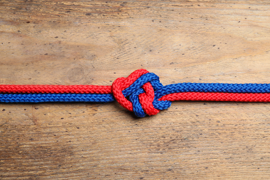
3 Ways to Tie Individual Goals to Business
Goals
_____________________
Help employees map their individual goals back to the organization’s goals.
Businesses are facing a dilemma when it comes to goals: according to Gallup, employee productivity increases by 56 percent when managers are involved in helping their reports align their goals with the needs of the organization. Despite this, only 44 percent of those employees felt they could connect their goals to those of the organization’s goals. This means that somewhere, there’s an alarming disconnect.
#text_div24146, #text_div24146 div { line-height: 120% !important; };
|
|
|
|
|
|
|
|
|
|
|
|
|
|
